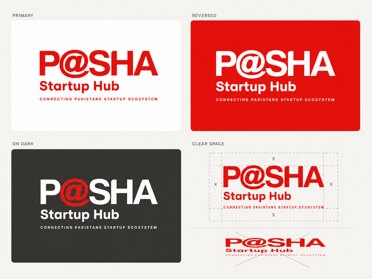
Nine logo and brand-identity directions for the P@SHA Startup Hub. Every option keeps the official P@SHA wordmark and the red @ untouched, per the 2026 brand guidelines. They share one palette and one typographic voice, so they read as a single family with nine expressions: three safe, three creative, three bold.
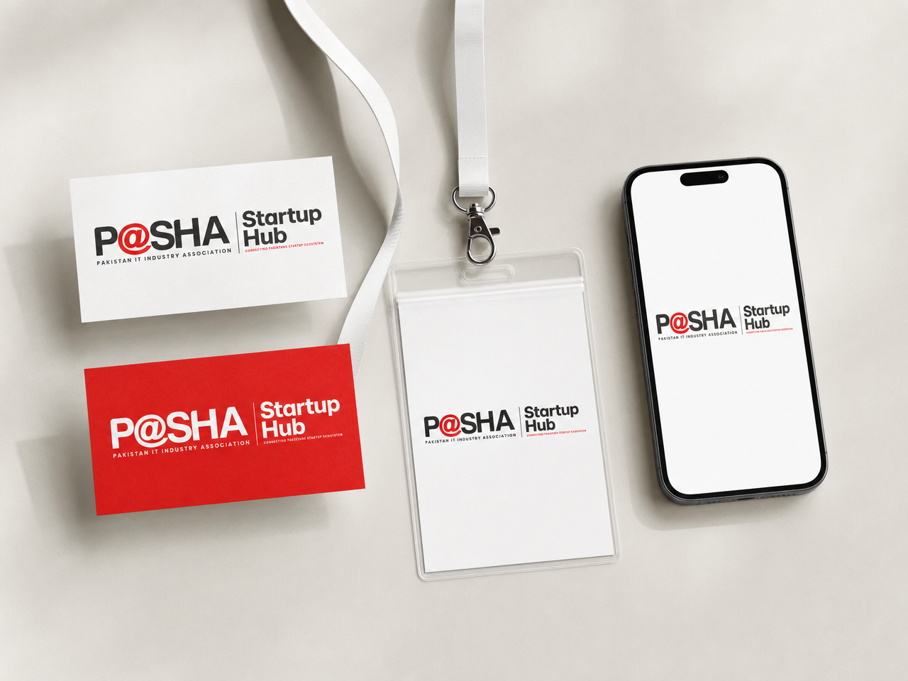
The Horizontal Lockup
The official wordmark, a hairline divider, and “Startup Hub” set in the same voice, with the ecosystem tagline beneath.
- Textbook sub-brand architecture: it reads as P@SHA presents, which carries exactly the institutional weight a Minister-fronted launch needs.
- The parent association line stays intact, so the association and the Hub never compete for authorship.
- The natural choice for formal surfaces: documents, MoUs, co-branded banners, press.

Brand system
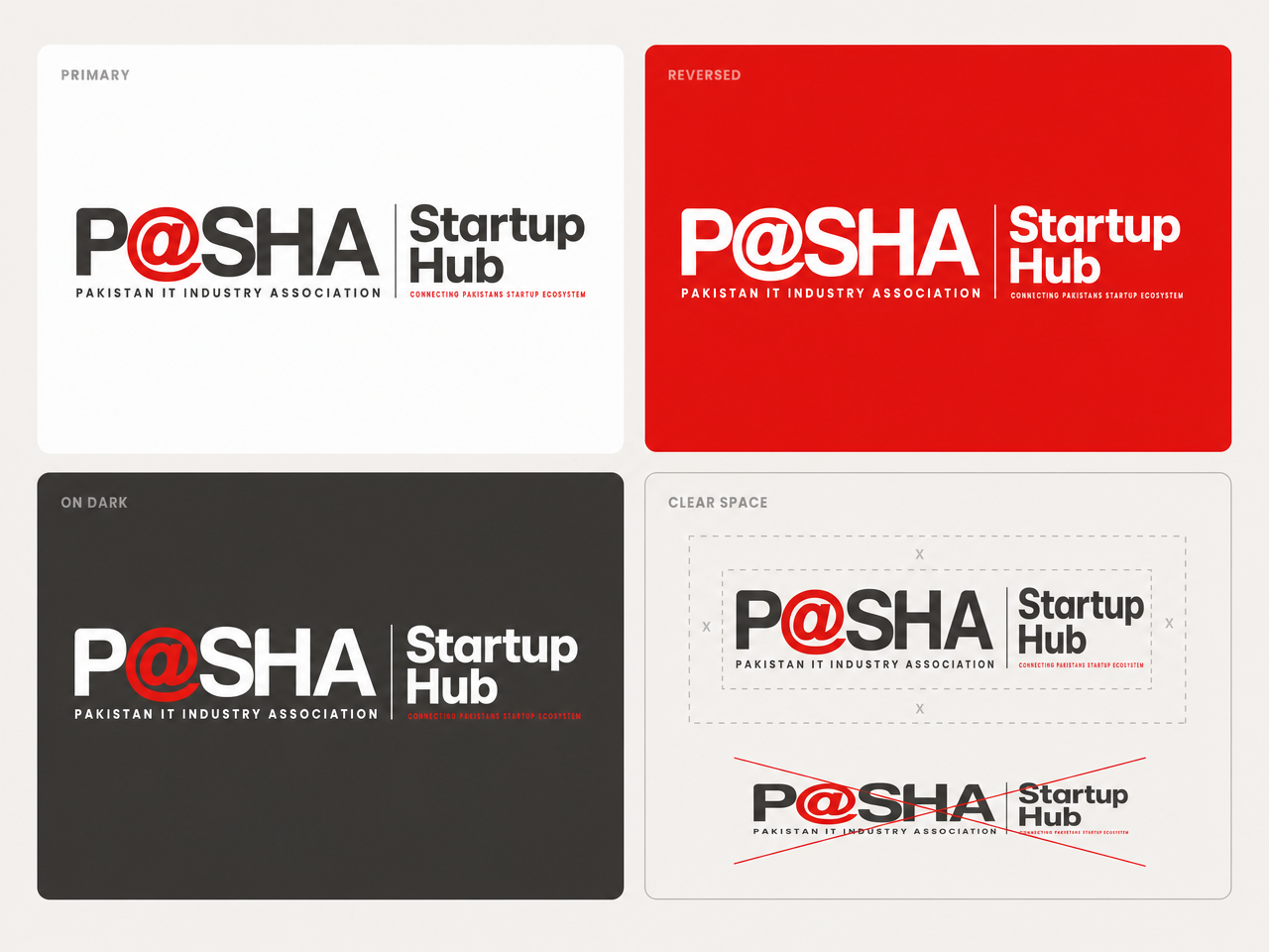

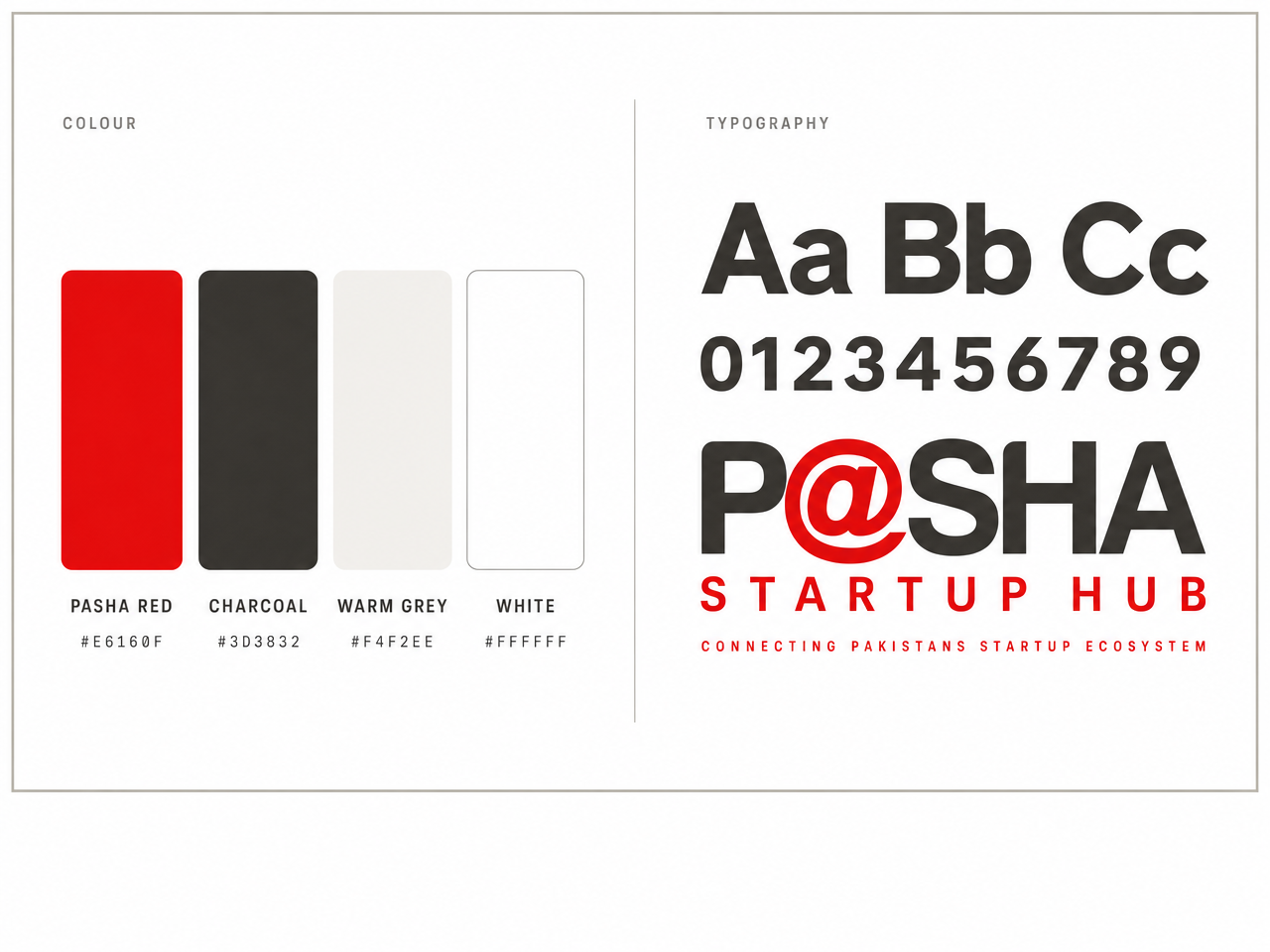
The Descriptor Swap
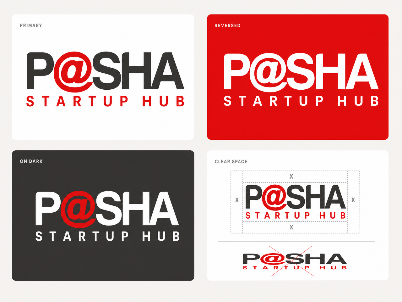
The existing logo’s exact structure, with the letterspaced line beneath the wordmark reading STARTUP HUB in brand red.
- Literally cannot be called off-brand: it is the brandbook’s own layout doing the work.
- The strongest at small sizes: favicon, social avatar, event badge, WhatsApp display picture.
- Zero redraw risk before Friday: the fastest option to take to production.

Brand system
The Insignia Tile
The official white @ insignia on a red rounded tile, beside the wordmark and a red “Startup Hub.”
- Gives the Hub what the committee instinctively wanted from the earlier concepts: a square mark that works as an app icon.
- Built from the brandbook’s own standalone insignia, so the tile is native, not invented.
- Pairs naturally with any primary option as the digital-product face of the Hub.
Brand system
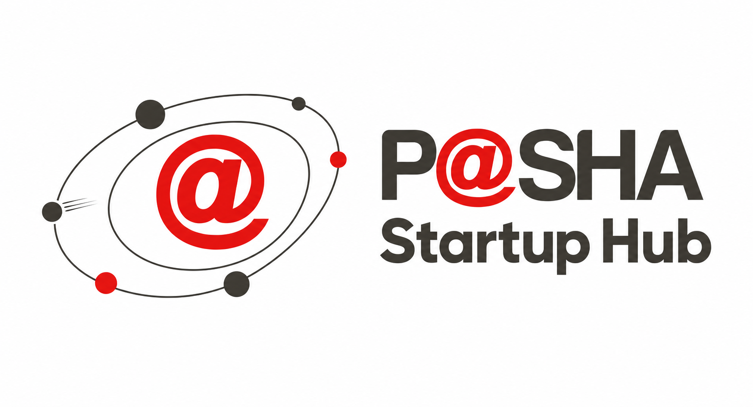
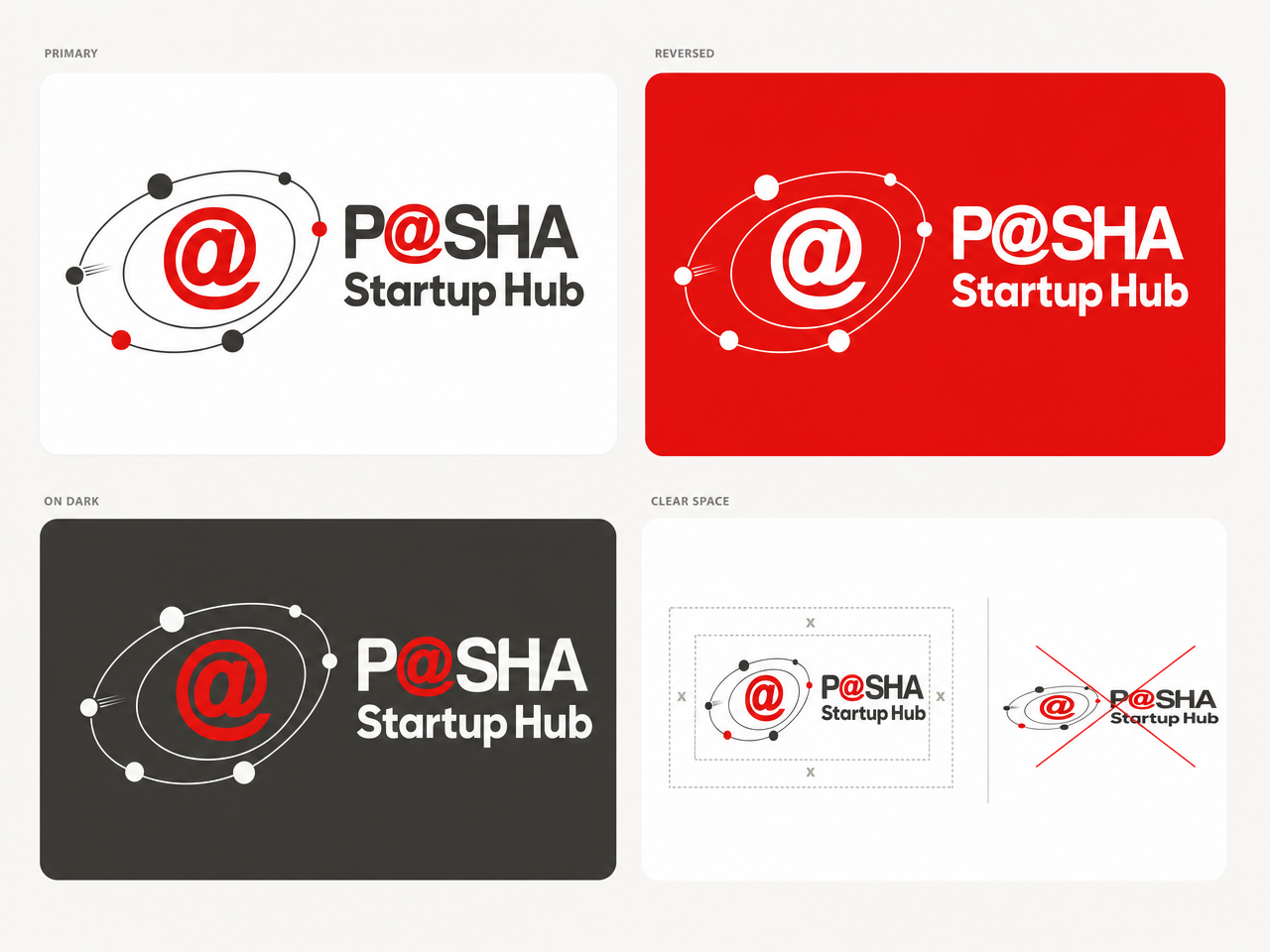
The Orbit System
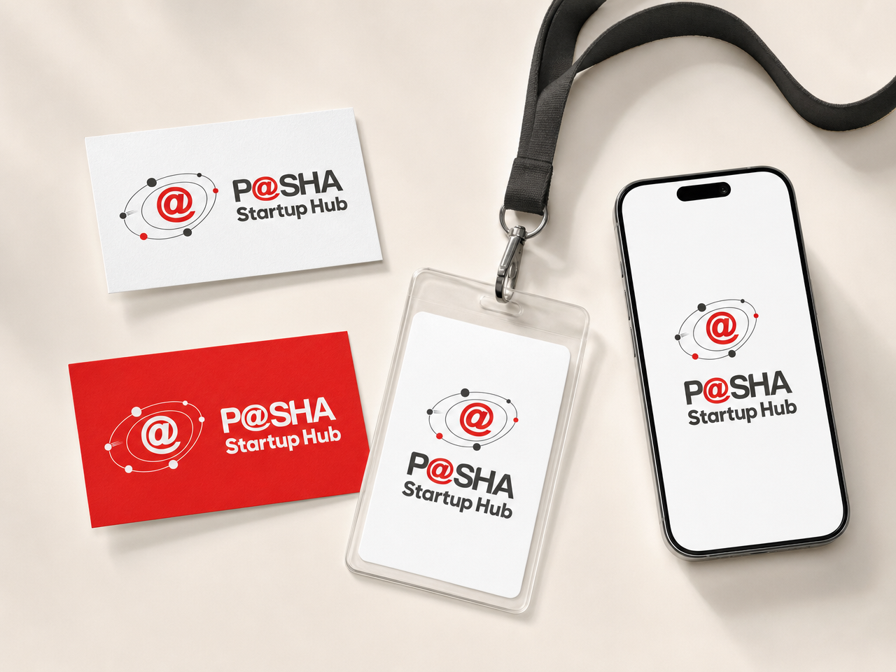
The red @ as the sun of the ecosystem, with startups as small bodies in orbit around it.
- Says “P@SHA is the center of gravity of Pakistan’s startup ecosystem” without a word of copy.
- The orbit dots animate naturally: a living version for the website hero and launch video.
- Warm and optimistic where most tech marks are cold.
Brand system
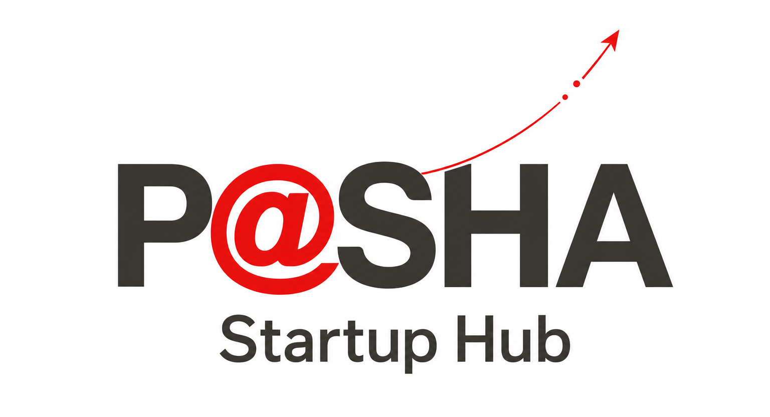
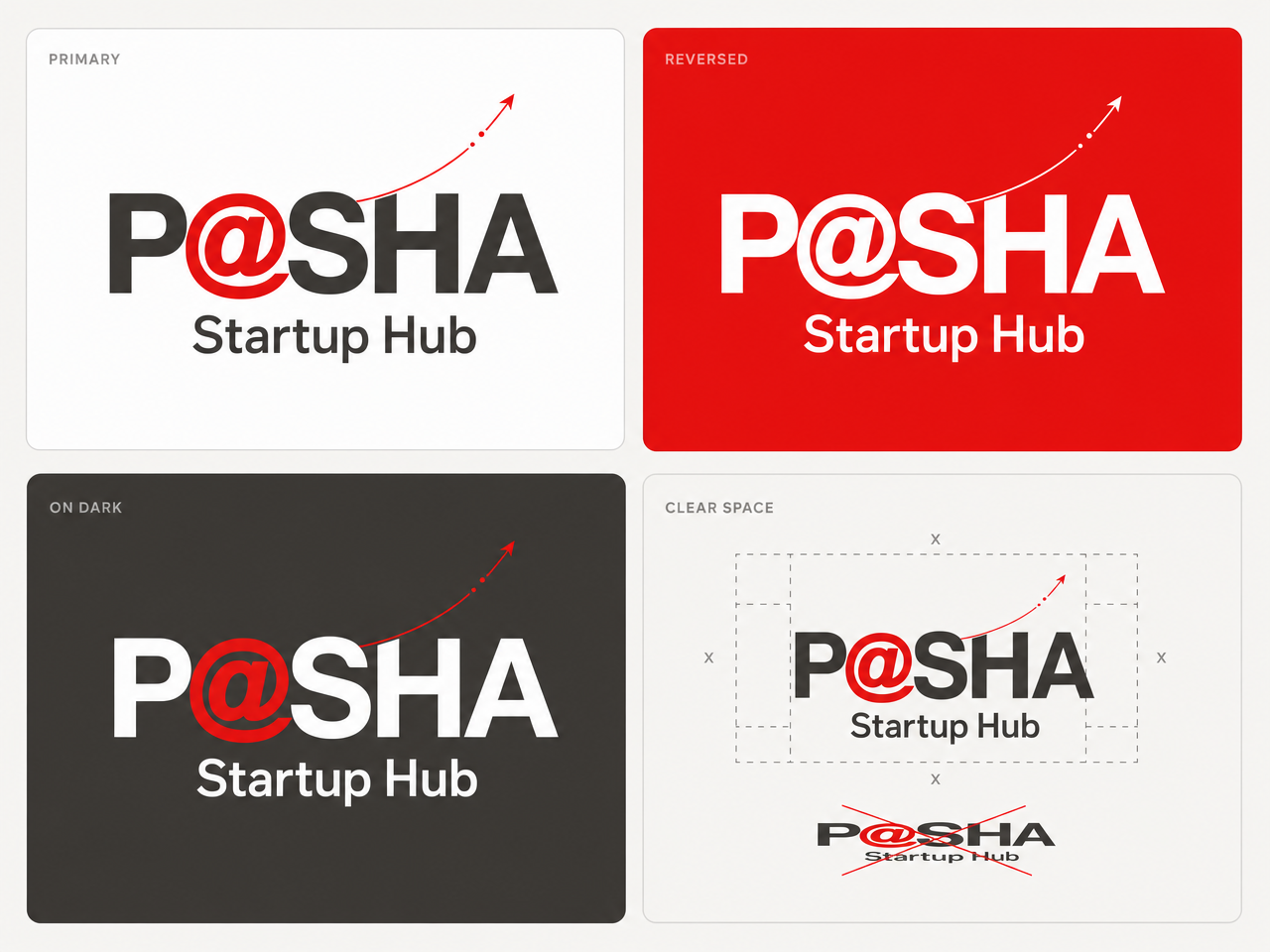
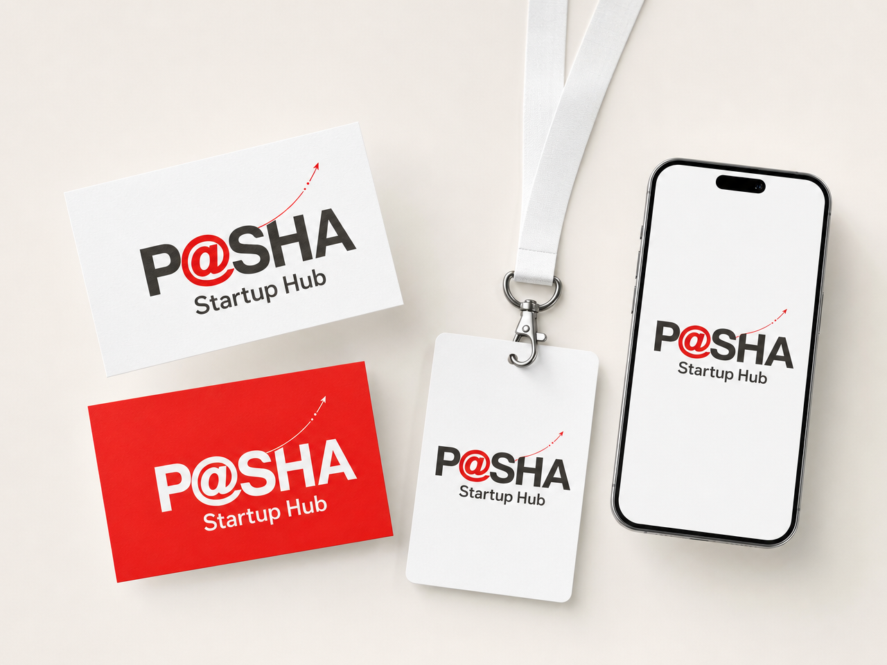
The Launch Trajectory
The untouched wordmark with a single red launch curve rising off the @, startups mid-flight along the arc.
- The most personality per gram of risk: the wordmark itself is never modified, the trajectory is an accessory element.
- One clean gesture tells the whole story: startups launch from P@SHA.
- Scales from a static mark to a motion identity: the curve draws itself in on load.
Brand system
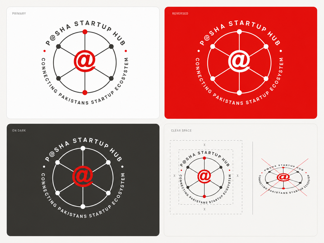
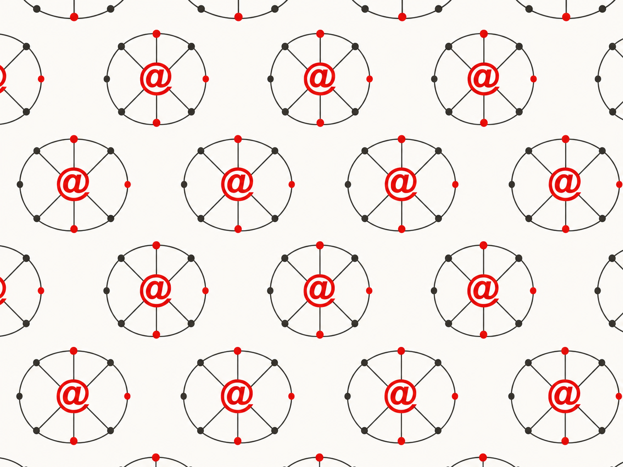
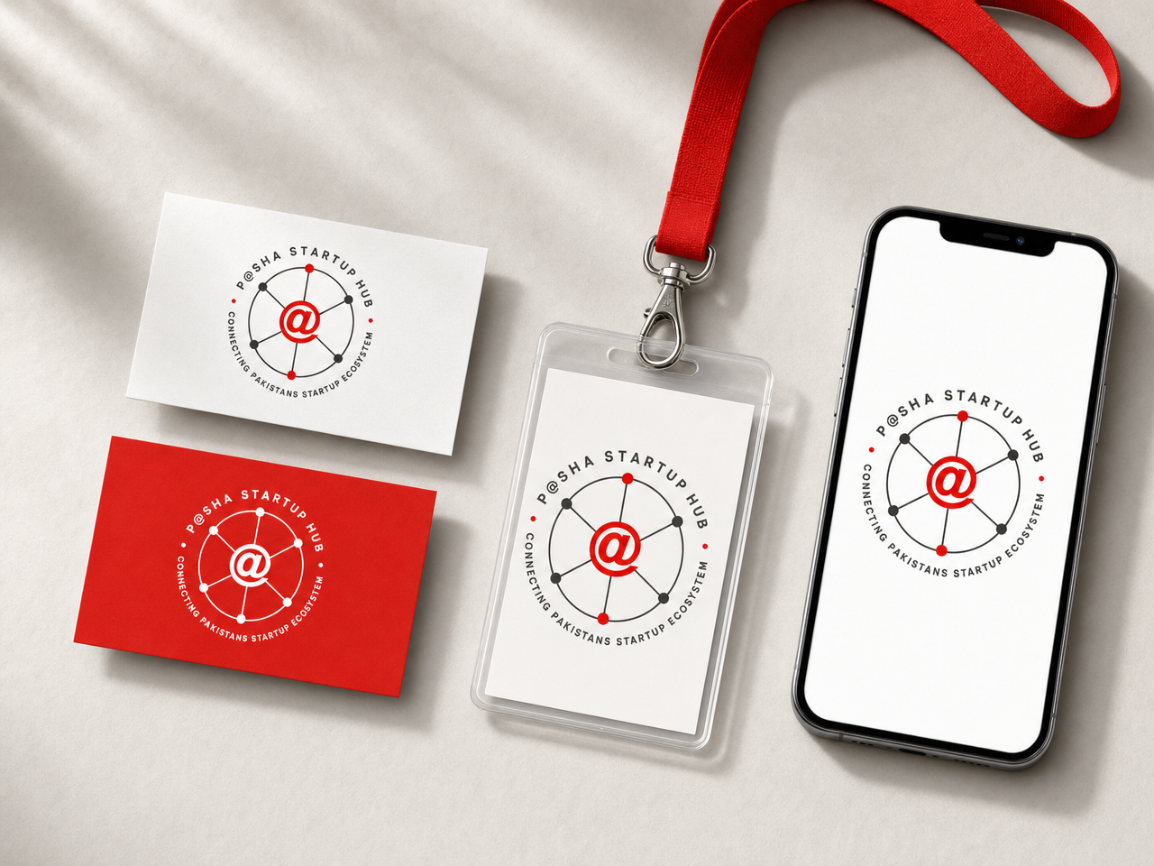
The Hub Roundel
A hub-and-spoke network badge: the @ at the hub, startup nodes on the rim, the full name and tagline in circular lettering.
- The literal meaning of “hub,” drawn as a mark: a star network with P@SHA at the center.
- Born for certification: a “Verified by the Hub” stamp on startup profiles, decks and reports.
- The event workhorse: lanyards, stickers, stage floor decals, embossing.

Brand system
The Supergraphic
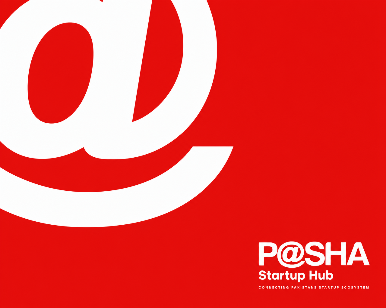
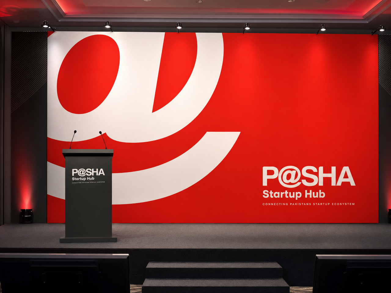
A giant white @ bleeding off a full-red field, with a razor-small text block holding the corner.
- Extreme scale contrast as confidence: the move of institutions that no longer introduce themselves.
- Purpose-built for large format: the CXO stage backdrop, report covers, social headers.
- Photographs better than anything else in the set: the podium shot writes itself.
Brand system
The Murmuration
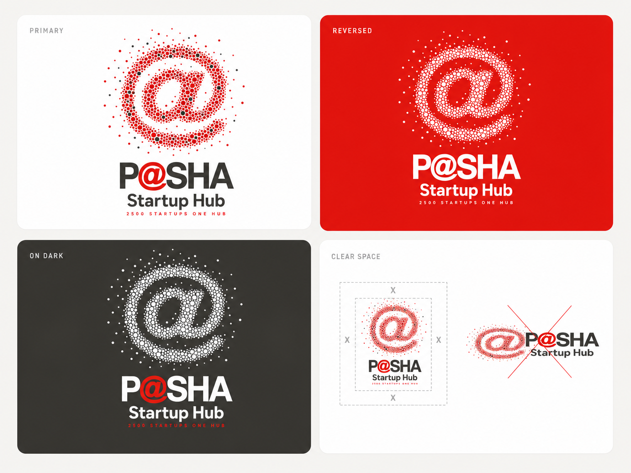
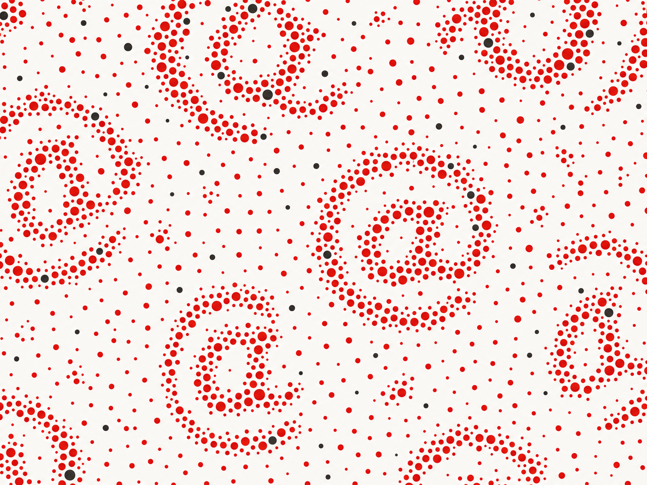
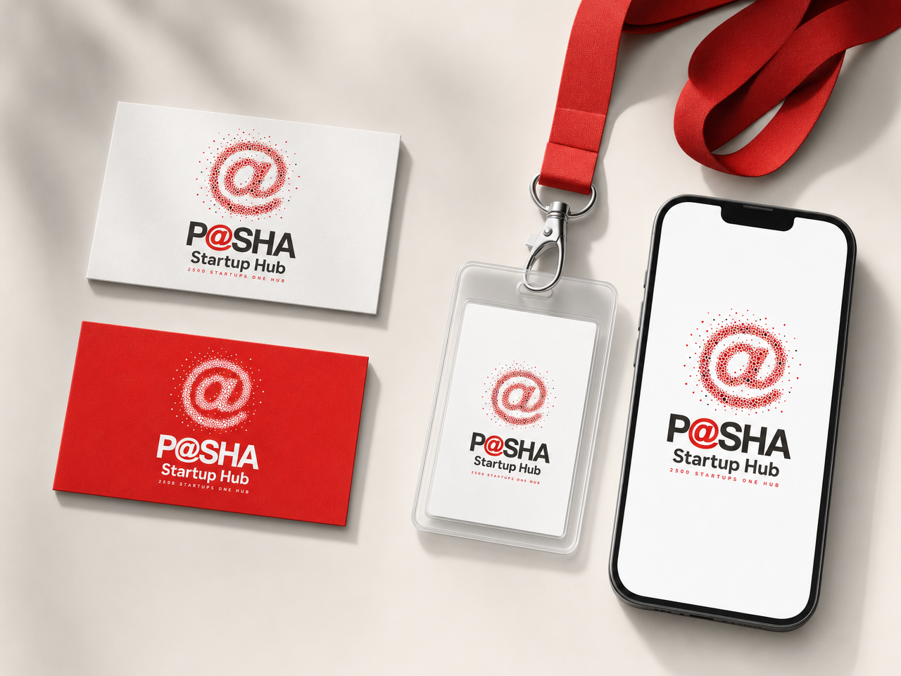
The @ built from hundreds of small dots pulling into formation, strays still joining the flock. 2,500 startups, one hub.
- The deepest concept in the set: the hub is literally made of its startups.
- A one-sentence stage story for the launch: “every dot on this mark is one of you.”
- Endlessly extensible: the dots become data visualizations, city maps, sector clusters.

Brand system
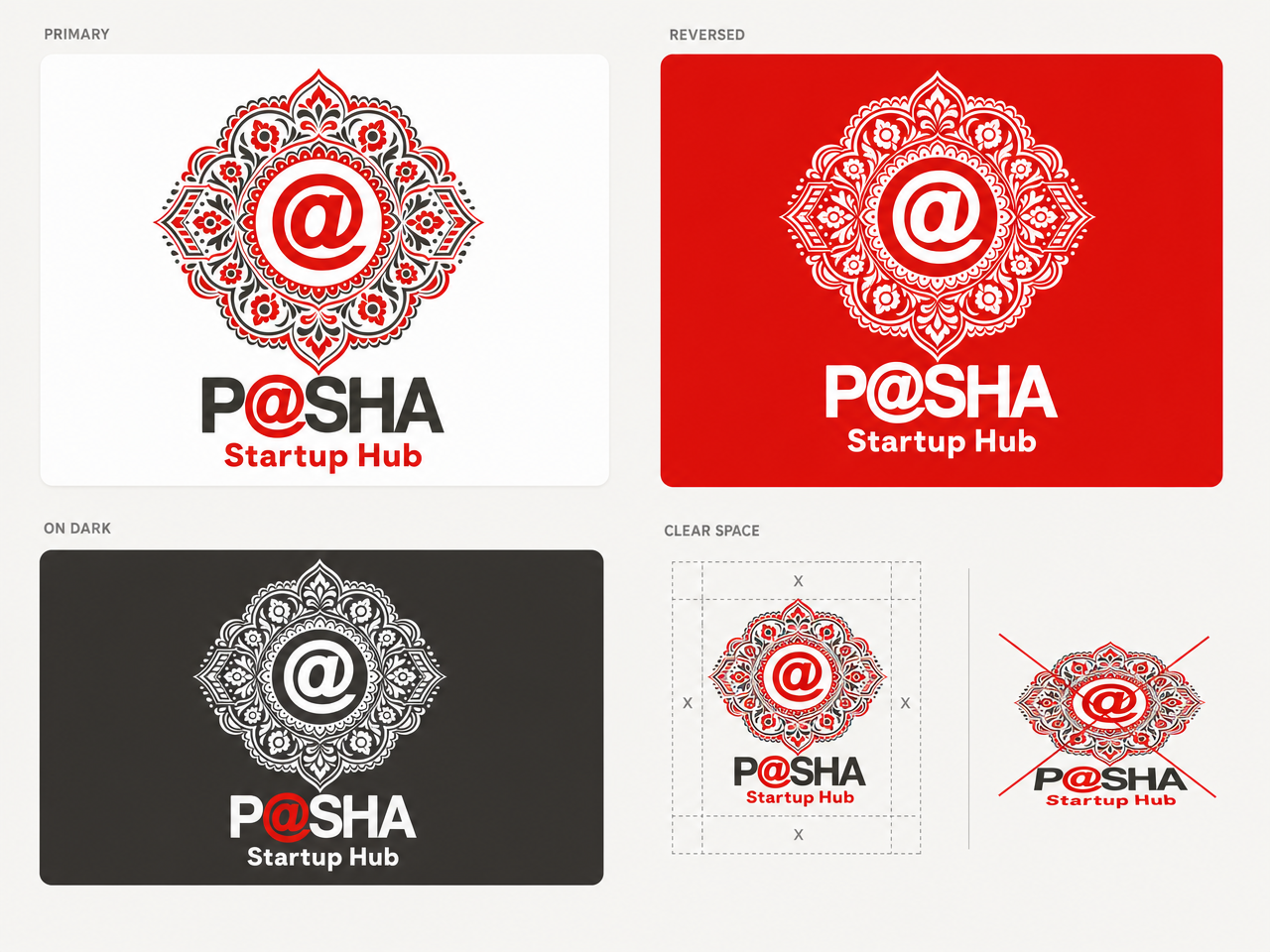
The Truck-Art Medallion
Pakistan’s most famous vernacular design language, disciplined to a strict red-and-charcoal duotone around the official @.
- Unapologetically Pakistani and unmistakably P@SHA at the same time: nobody else in the ecosystem would dare it.
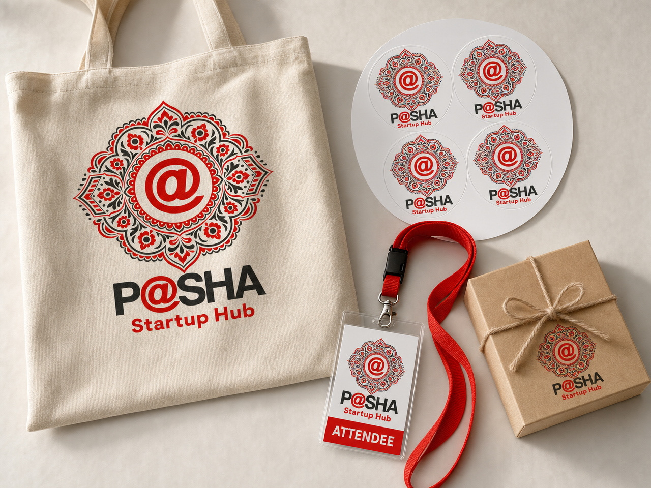
- The merch piece every CXO attendee actually keeps: totes, stickers, gift boxes.
- International guests photograph this one: PSEB, Ignite, foreign delegations.

Brand system